Redesign Philips Customer Portal
Internship project with TP Vision
2023 Apr-2023 Sep
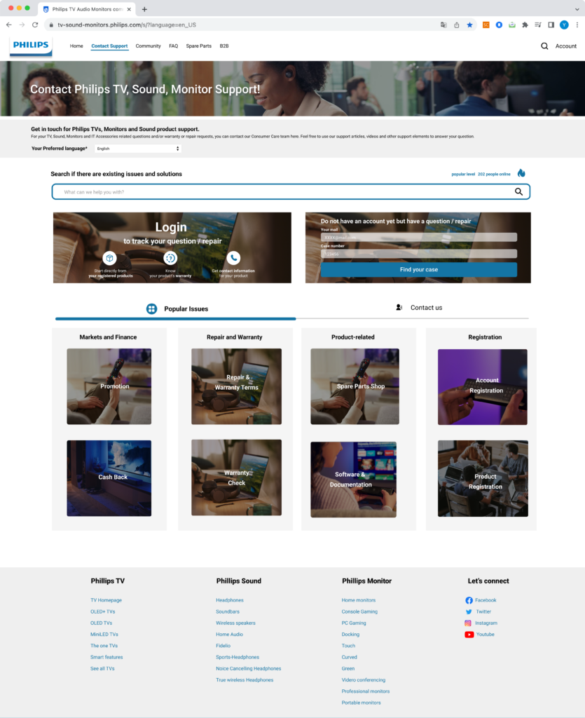
This project was my internship assignment aimed at optimizing the customer contact process on the Philips customer portal and improving the interaction flow for users reaching out for support. Imagine you’ve purchased a TV from Phillips—what actions can you take on this website? And if the TV encounters an issue, how would you reach out for customer service?

Role
UXUI Designer
User Research
Competitive Research
Heuristic Evaluation
Hi-fi Prototype
Mockup Iteration
Deliverables
Quantitative UX Research
Competitive Research
Optimized User Flow
Hi-fi Prototype
Interface Design
Background
Help Customers Reach Out for Customer Support
This customer portal is designed for individuals who have purchased Philips TVs, audio equipment, and monitors. It is separate from Philips’ official website, and only users with product-related issues will be redirected here.
Primarily Offers Two Types of Support Contents
Currently, many resources are available on the Philips customer portal, including contact support channels, self-service information, Philips product registration, etc.
- Call center contact info: Phone, email…
- Self-service information: Topics, Videos, Community

Design Challenges
Optimize the Process to Access Customer Support
1. Address users' inability to solve product issues using website resources
This website is designed to help users solve issues with their purchased products. While still in development, feedbacks like that is critical to the site’s purpose. We need to identify where users encounter difficulties and how we can better guide them to find their best solutions.
2. Philips aims for customers to find solutions independently, while customers prefer direct call center support
From Philips’ perspective, the company prefers customers to solve issues using self-service resources on the website, like topics or videos, as the call center may be overwhelmed with requests. However, for customers, the most efficient way is often to contact the call center directly.
Process and Research Methodologies
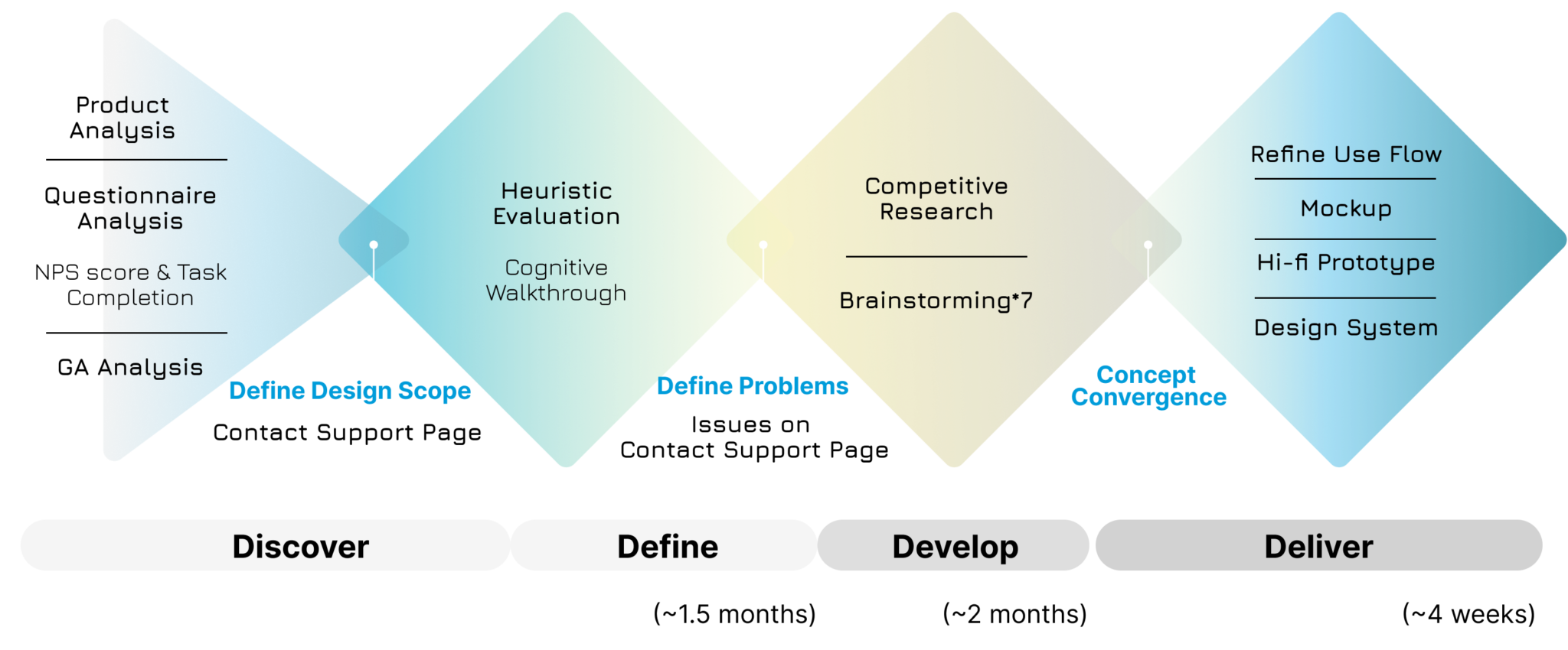
Quantitative Data Analysis
To narrow down design scope from several service
Heuristic Evaulation
To identify issues on contact support page
Competitor Research
To reposition the current information structure and elements
If you're interested, you can find details about methodologies here
Quantitative Data Analysis
Google Analytics (GA)
We use three GA reports—Audience Overview, Acquisition, and Behavior Flow—to understand our users, track sources, and analyze their actions on our website, such as time spent on each page and session completion. These insights help us explore where users encounter difficulties.
Medallia survey
After a user stays on the website for a certain period, a survey will automatically appear, asking about their satisfaction, the purpose of their visit, and whether they achieved their goal. This helps us identify user pain points.
Heuristic Evaulation
Cognitive Walkthrough
Though this project heavily relies on quantitative data, we recruited 5 participants with design backgrounds for a cognitive walkthrough to gain more user insights. This activity aimed to test if users can successfully access service help, whether by finding a contact number, writing an email, or locating useful articles. Tasks performed along with four questions for each section to identify the difficulty level of completing that section:
- Will the user try and achieve the right outcome?
- Will the user notice that the correct action is available to them?
- Will the user associate the correct action with the outcome they expect to achieve?
- Will the user see that progress is being made towards their intended outcome?
Competitor Research
Table Analysis Method
In our competitive analysis, we referred to brands selling similar products, including LG, Samsung, Sony, Vizio, Hisense, Huawei, and Dell. We focused on understanding the customer service each brand offers and how they present these services.
Add-Subtract-Multiply-Divide Analysis Method
In this analysis, we categorized website elements into four types: addition (what we can enhance), subtraction (areas where we do not need), multiplication (opportunities for innovation), and division (what we can integrate differently).
Discover
Three key pages users visit and their main issues
Most users come to 3 pages:
- Contact Support
- Topic
- Account Service
And they generally face problems in:
- Solving issues with Philips products
- Arranging for product repair or exchange
Source: Medallia survey & GA
Hypothesized issues based on user activity on 3 key pages
Contact Support Page
Contact Support page may not be engaging, or users may have trouble finding the information they need
Most users browse Contact Support page but repeatedly leave and return.
Account Page
Users log in but keep searching without reaching their goal
After logging in, users land on the “My Case” page, where they can view their case/repair request progress. However, they do not spend much time on these pages, yet their session duration is significantly long.
Topic Page
Users are indeed using the Topics page to find the information they need
High page views and good average dwell time suggest that users likely browsed multiple articles to find the information they needed.
Focus on resolving the issues with Contact Support page
- Filters are not intuitive
- The case creation process should not require mandatory registration
- Users are disappointed with the unavailable call center

More Research Details
If you are interested,
more details on data research and competitive research can be found here
Define Design Goal
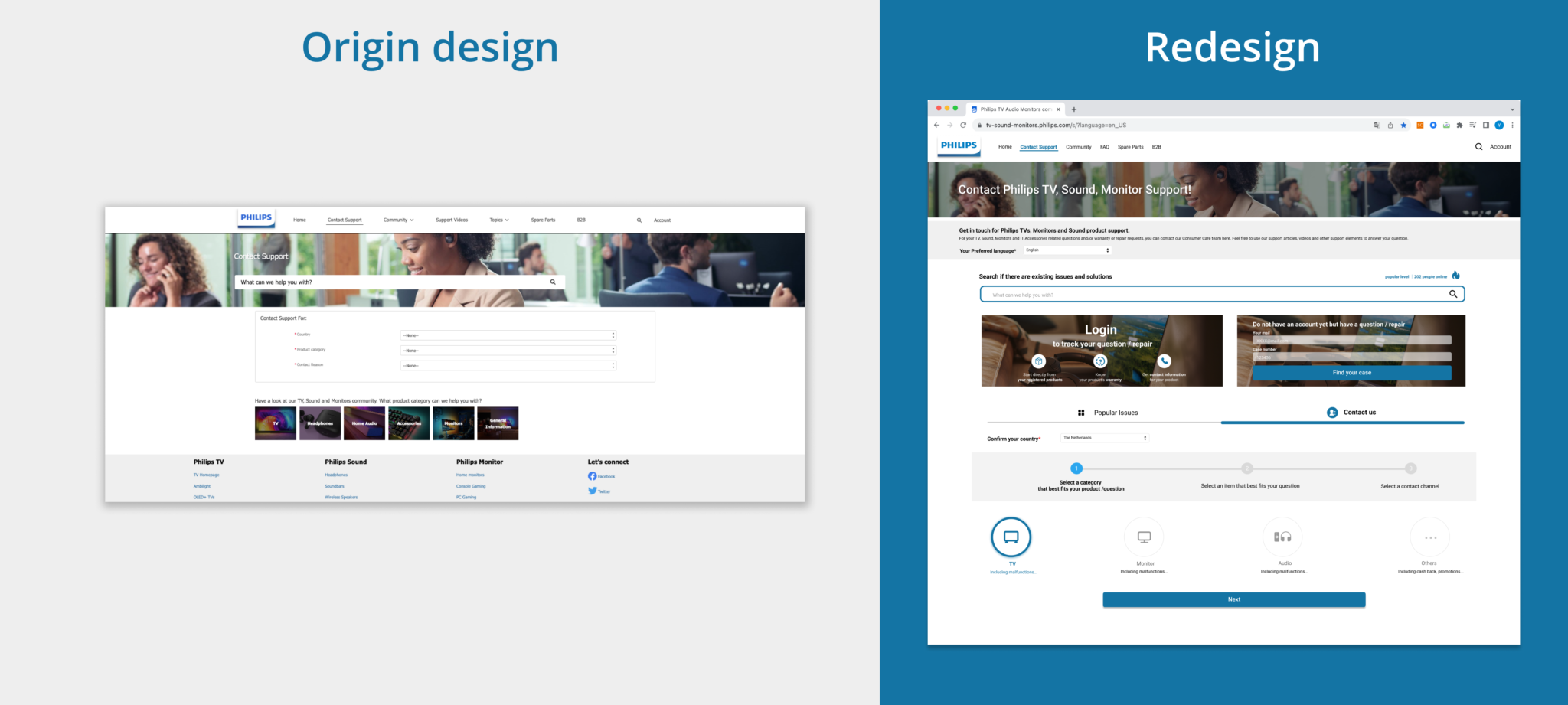
Adjust the Use Flow before reaching contact support
- Design alternative methods, apart from filters, to help users narrow down their issues before they reach contact support
- Guide users to explore Topics/Videos to reduce the load on the call center
- Remove the requirement to log in before sending a email, and explore other ways to encourage users to use the membership system
Develop
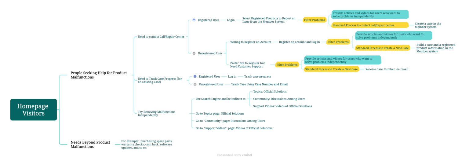
Reanalyze various user needs and restructure flow and functions on the website
Refine the Use Flow through competitive research
Analyze the advantages and disadvantages of different use flows
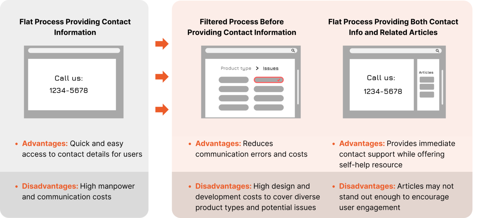
Adjusted use flow from flat process to filtered process
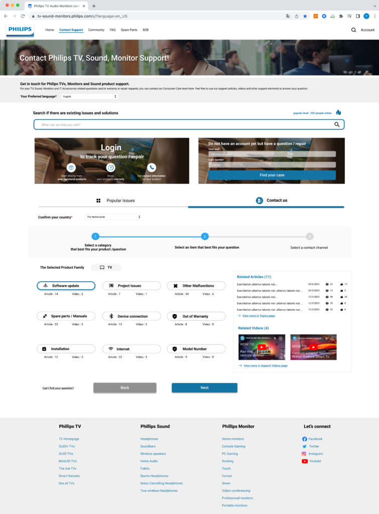
Based on competitive research, instead of the original flat process, we decided to introduce a three-step approach to help users narrow down their issues more effectively
Within these three steps, the new design offers more detailed product issue categories to further refine problem identification and guide users to the most relevant support
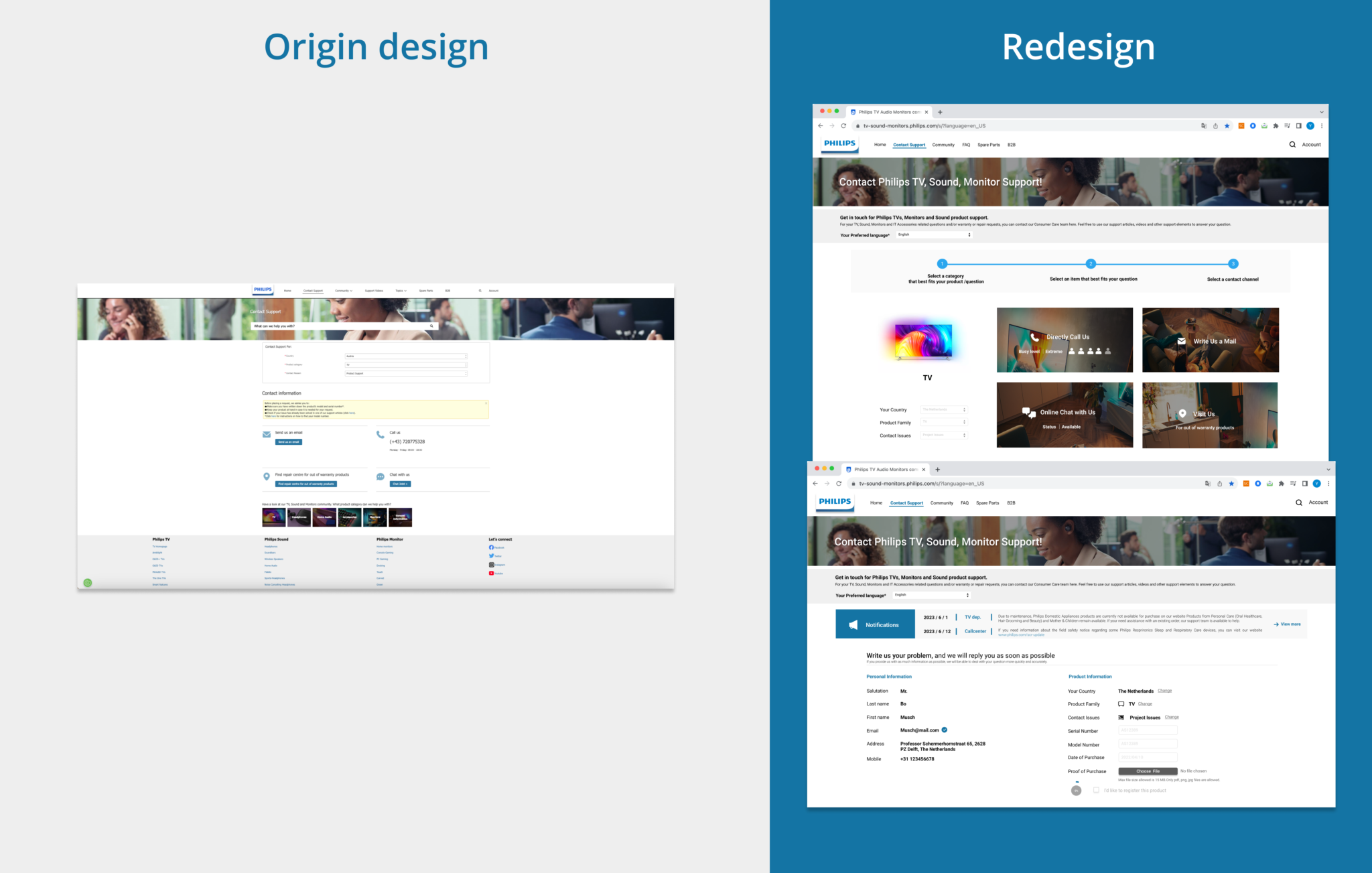
Additionally, we display related articles and videos alongside issue selection to assist users who are willing to troubleshoot independently, reducing the pressure on the call center
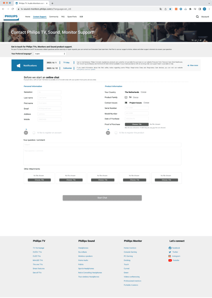
Enhance the form design to ensure users prepare necessary information, such as product issues and registration serial numbers, before contacting the call center, thereby reducing communication costs
Demonstration of new filter module and form design
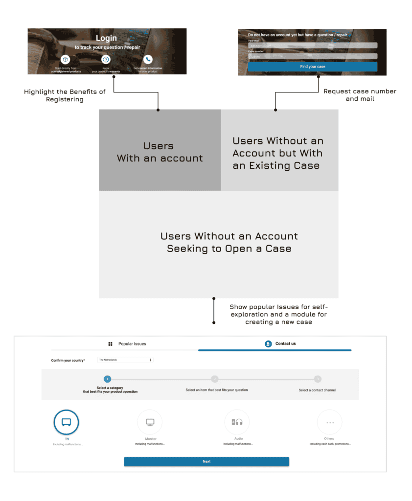
Refine the Information Structure to offer the best service for different user needs
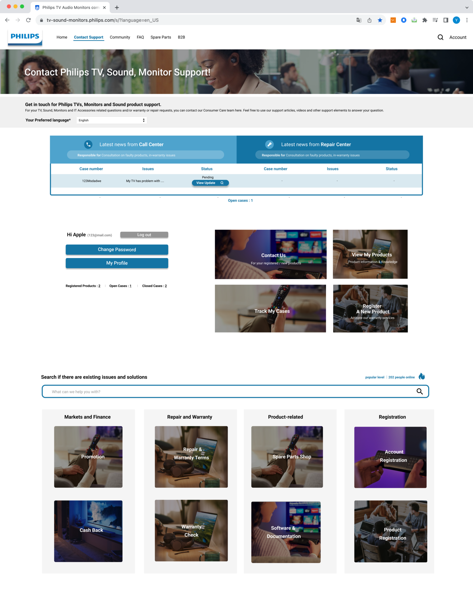
Redesign Contact Support homepage with 3 sections for accessing various needs
- Registered users service
- New Visitors service- “Contact us” module and “popular issues”
- Case tracking service for visitors without an account
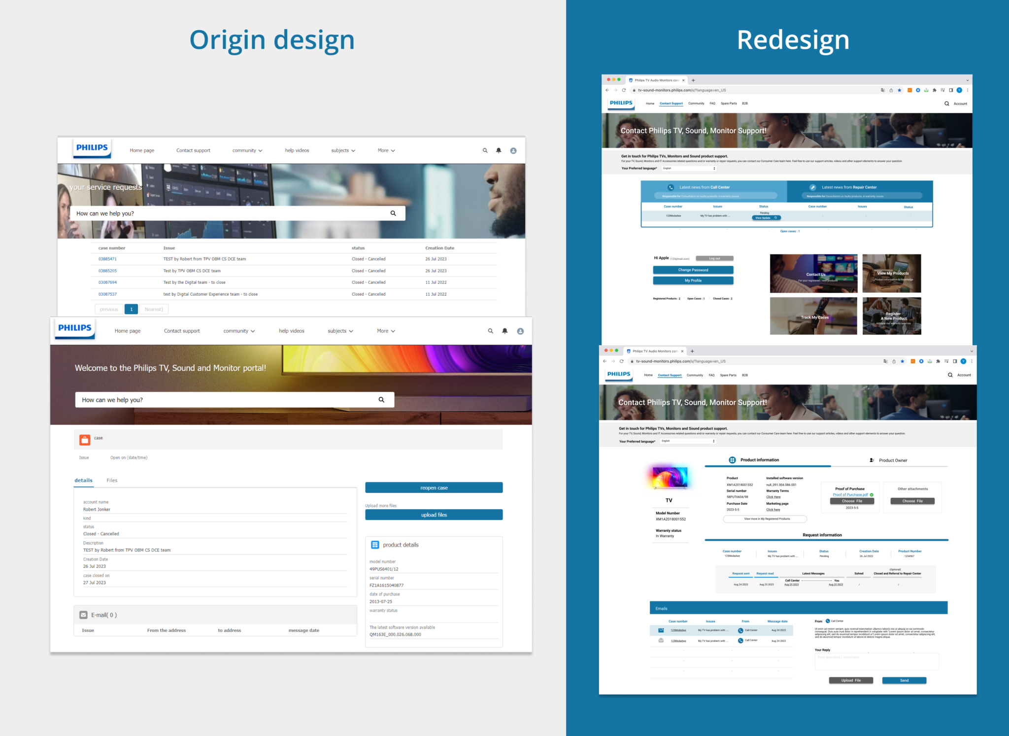
Optimize registered user service
- “Contact Us” Module: Quickly reach the call center for a registered product.
- “Track My Cases”: View the progress of completed cases and access the mailbox.
- “Register a New Product”: Register a new product.
- “View My Products”: Access and view all registered products.
- Search bar & Popular Issues
Deliver
"Contact us" Module
Display of four contact channels
Case tracking system & membership system
More Design Details
Find more demonstrations of the filter module, new visitor services, and membership services here
Concept Value
Provide users with a well-organized information structure
Since significant design changes require more time and discussion, I couldn’t participate in the design validation phase. I thoroughly reviewed and defined the value of our redesign vision and the issues our team has been addressing:
Ensure Filter process is clear and intuitive for users to navigate
Give users a clear sense of step-by-step progress in solving their problems
Refining the problem filter to include product-specific issues is a challenge, as it requires organizing product information. The original Topic page categorized issues by product types but didn’t connect them to contact options. However, after team discussions, we found this approach doable. It helps reduce communication costs for companies with many products and gives users a sense of progress in solving their problems.
Guide users to use self-service resources to reduce pressure on the call center
Similarly, this design means the company needs to organize relevant articles and videos for different product issues. However, with this approach, we hope to encourage users to try all possible solutions before contacting the call center. In the new design, we still provide call center contact information, but we aim to naturally present articles and videos to the user.
Add service prompts, such as informing users in advance about the customer support wait time, to reduce frustration
Let users prepare the necessary information in advance to reduce communication time
Do not force users to register an account before contacting call center
Since Philips has customers around the world, and support channels vary by region, our goal is to minimize users’ expectations by clearly showing the current support status and listing any materials they need to prepare. We’ve also created a way for users who don’t want to register to contact customer support without needing an account.
Integrating existing services into the membership system to offer more personalized support
Clearly show the case progress
Redesigning the membership system wasn’t part of our original plan, but we realized it was necessary to differentiate case tracking for members and non-members. On the other hand, Philips wants to encourage more registrations, but if being a member doesn’t improve the experience, why would users sign up? So, we integrated existing contact support services into the membership system to improve the membership experience and offer a more personalized experience.
