Redesign the Route Planning App 9292
Team project with 9292.nl
2022 May-2022 October
The strong focus on sustainability has deeply integrated public transportation into everyday life in the Netherlands. The 9292 app, a popular tool among locals, consolidates complex transportation information into one mature digital product. But what lies ahead for such a well-established app?

Team
Lilly Filthaut
Zhuowen Tan
Elif Şare
Mitchel Trap
Role
UX Designer
User Research
Hi-fi Prototype
Mockup Iteration
Design Validation
Deliverables
Qualitative UX Research
Design Strategy
Hi-fi Prototype
Interface Design
Background
9292 is a mature route planning app with all you need
The app 9292 is a route planning app made to provide the users with all the needed information during their journey from the beginning to the end. The app allows users to get travel advice, save it, and share it with others.
9292 dedicated to developing personalized features
The 9292 app offers more than basic route planning features. It includes personalized options such as setting walking speed, ideal walking time, and saving search shortcuts.

Tasks from Case Owner 9292
Create a Personailzed Route Planning Experience by
1. Enhancing the functionality of 'adjusting walking speed'
9292 had already developed a novel feature to enable users to set up their walking/riding speed. However, this function has not been widely used by users.
2. Improving the overall using experience
As a mature app, 9292 would like to know how to further improve the overall UX experience.
Challenges from Our Perspective
9292 does not have a specific target user group
It is hard to define a target user group for a route planning app because anyone may need to use this app, especially in the Netherlands, where public transportation is widely used.
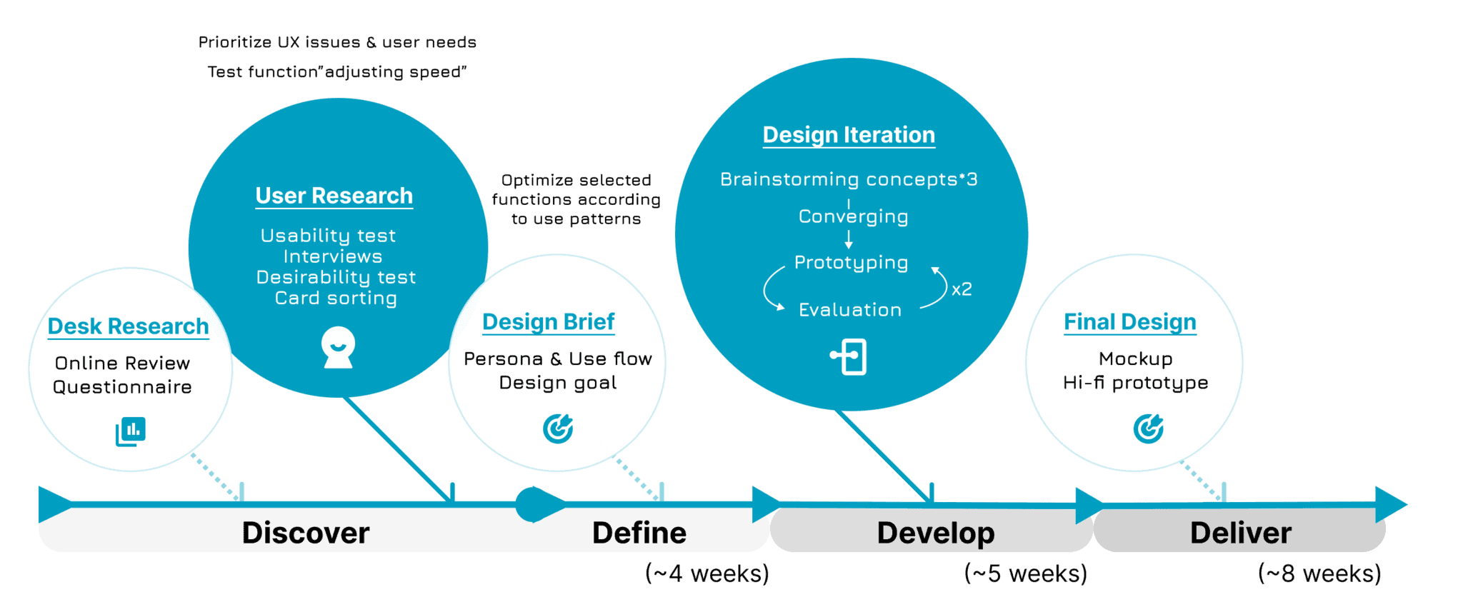
Process and Research Methodologies
Field interviews +
Online reviews +
Questionnaire
To explore 9292’s users and current using experience
Usability test +
SUS scales +
In-depth interviews
To identify current ux issues and usability performance, including how users do with “adjusting walking speed”
Desirability test +
Card sorting
To reposition the information structure and elements of the original design to inspire further design ideation
If you're interested, you can find details about our methodologies here
Questionnaire
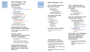
We reviewed the 2022 questionnaire by the 9292 team, which gathered 514 responses. It focused on public transport usage, reasons for using route planning apps, and preferences for personalized settings.
Online Reviews

We collected 112 online reviews from the Google Play and Apple App Stores, split between 54 Dutch and 58 English speakers. By clustering feedback, we identified common user issues and areas for potential improvement.
Usability Test
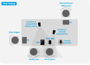
We recruited 8 participants aged 20-30, all with route planning experience. During the test, we designed three open-ended scenarios to encourage users to plan routes and explore personalized settings and filters.
Interview
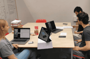
1. We conducted random field interviews with 11 people at Delft Station and bus stops near TU Delft to understand their 9292 usage habits, including their opinions on customized settings.
2. In-depth interviews were performed after each usability test. We composed questions that dig into users’ travel habits in order to make connections between the users’ perceived problems and their personal use patterns.
Desirability test
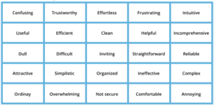
To measure intangible emotional responses from participants, we selected 25 vocabularies from the Microsoft Desirability Toolkit and required participants to select five words that best described the products. It helped participants to describe their current and expected using experience.
Card sorting
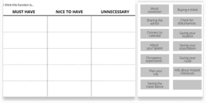
In order to understand users’ priority of requirements for each function, we conducted card sorting. Participants were given a predetermined set of categories: must-have, nice-to-have, and unnecessary. They were asked to organize different features into these categories based on their personal experience.
Discover
Overview of 9292 users and current experience
Information seekers
We refer to 9292 users as “information seekers” rather than “information explorers.” We believe that most 9292 users already have a good understanding of their needs. They do not eager to explore other information.
Source: Reviews & Questionnaire
Focus on functionality of address-searching
For information seekers, the efficiency of address-searching features is most important. The priority should be ensuring that users experience a smooth and trustworthy process when searching for addresses or routes.
Source: Reviews
Need useful customized settings / filters
We see an opportunity in that users do use certain personalized settings to get route advice that better meets their needs. From desk research, we also identified several settings that users frequently use such as adding favorite locations and extra transfer time.
Source: Questionnaire
A useful, helpful and simplistic app but overwhelming and confusing
We divided the user journey into three stages: the searching phase, the comparing phase, and the post-comparing phase. Interestingly, not all users go through every stage, leading to diverse experience feedback.
Source: Desirability test
Usability issues
Searching
Inefficient searching and overwhelmed process to add 4 types favorites: location, stop, route and entire route advice
Info presentation
Ineffectively compare different travel options
Filters
No noticeable change after using filter options
Walking speed
Walking speed adjusting features hard to understand and use. Users even do not know their walking speed.
Saving entire route advice
Lack of feedback and guidance after saving advice. Hard to resume the previous search outcome.
Sharing
Hard to find Sharing advice function. Shared travel advice are not readable
Define Design Scope
1. Making the walking speed feature usable
Interview results showed that users often overlook or misunderstand this new feature. Obviously, asking users to provide their walking speed is not understandable. To meet 9292’s original goal, our design team must make it more intuitive
2. Improving information display, searching, and save/share features
Based on the results of previous research and card-sorting, we decide to focus on information display, searching (adding favorites and filters) and save/share features
Define Design Strategy
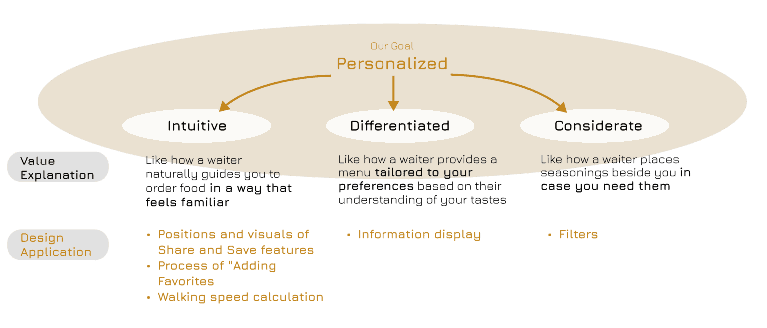
Define three values to achieve "Personalized": Intuitive, Differentiated and Considerate
We define three key values and explain how each enhances the personalized experience. Based on these values, we categorize the functions into their respective value-driven areas.
Create Personas and Use patterns
To understand different users’ information needs, favorite-adding habits, and filter preferences, we created three personas based on distinct commuting patterns and needs.
More Research Details
If you are interested,
more details on desk research, usability testing, personas, and use patterns can be found here
Develop & Deliver
To achieve "Intuitive"
Redesign Use Flow of "Adding Favorites"
Research Insights
- Users do not actively add favorites or even realize such a feature exists
- Users prefer directly typing an address rather than adding location stops or routes
- Adding routes is not essential for most users and it requires multiple steps to create a favorite route
Redesign
- Allow users to add locations/stops/routes immediately after entering an address, instead of requiring an extra button for adding favorites
- Add favorite locations during onboarding settings

Redesign the method for "calculating walking speed" and its position
Research Insights
- Most users do not know their walking speed
- Placing this feature in the sidebar/navigation drawer doesn’t make sense, as walking speed might change based on different scenarios
Redesign
- Let the app learn users’ walking speed in reverse
- Place the adjustment option on the search results page for easy access
- More guidances to introduce the new measurement in onboarding settings

Redesign the visuals and position of "Share" and "Save" features
Research Insights
- Icons of Share and Save features are not intuitive
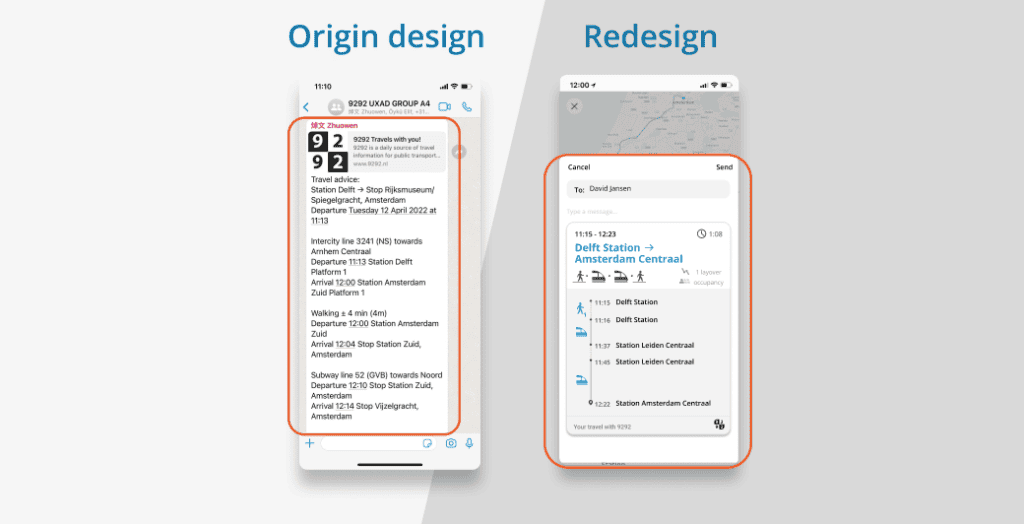
- Shared advice was presented as text with low readability
- Many take screen shots instead
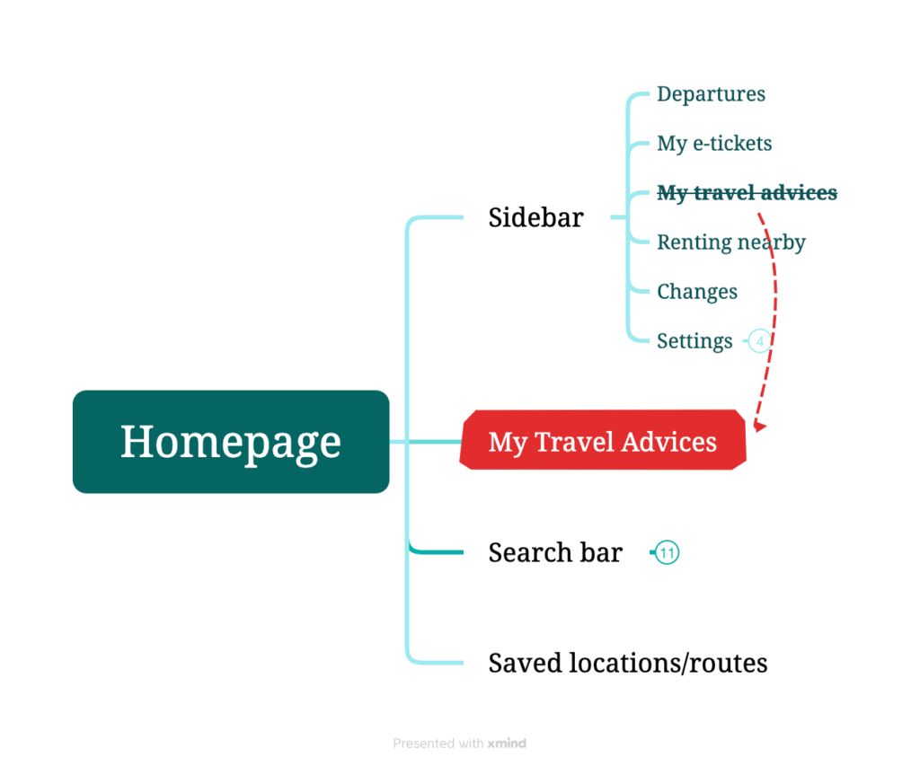
- Saved route advice was originally placed in the sidebar/navigation drawer, making it difficult to find
Redesign
- Reselect more universally recognizable icons for the share and save features
- Redesign saved route advice in a more familiar Apple Wallet-style card format
- Place saved route advice on the homepage for quick access
To achieve "Differentiated"
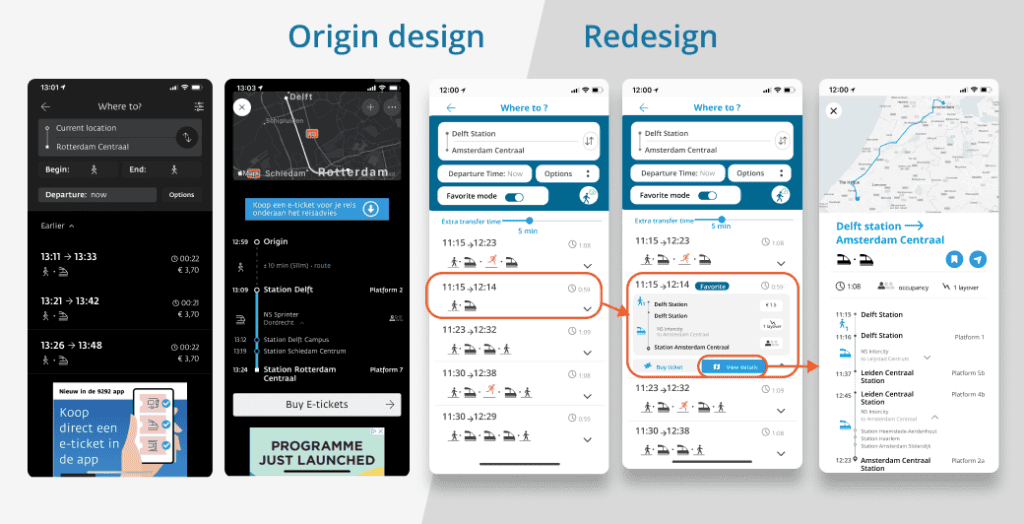
Redesign the route information display
Research Insights
- Different user groups need different features and information
- Users often switch between the search result page and the route detail page to compare different transfer options
Redesign
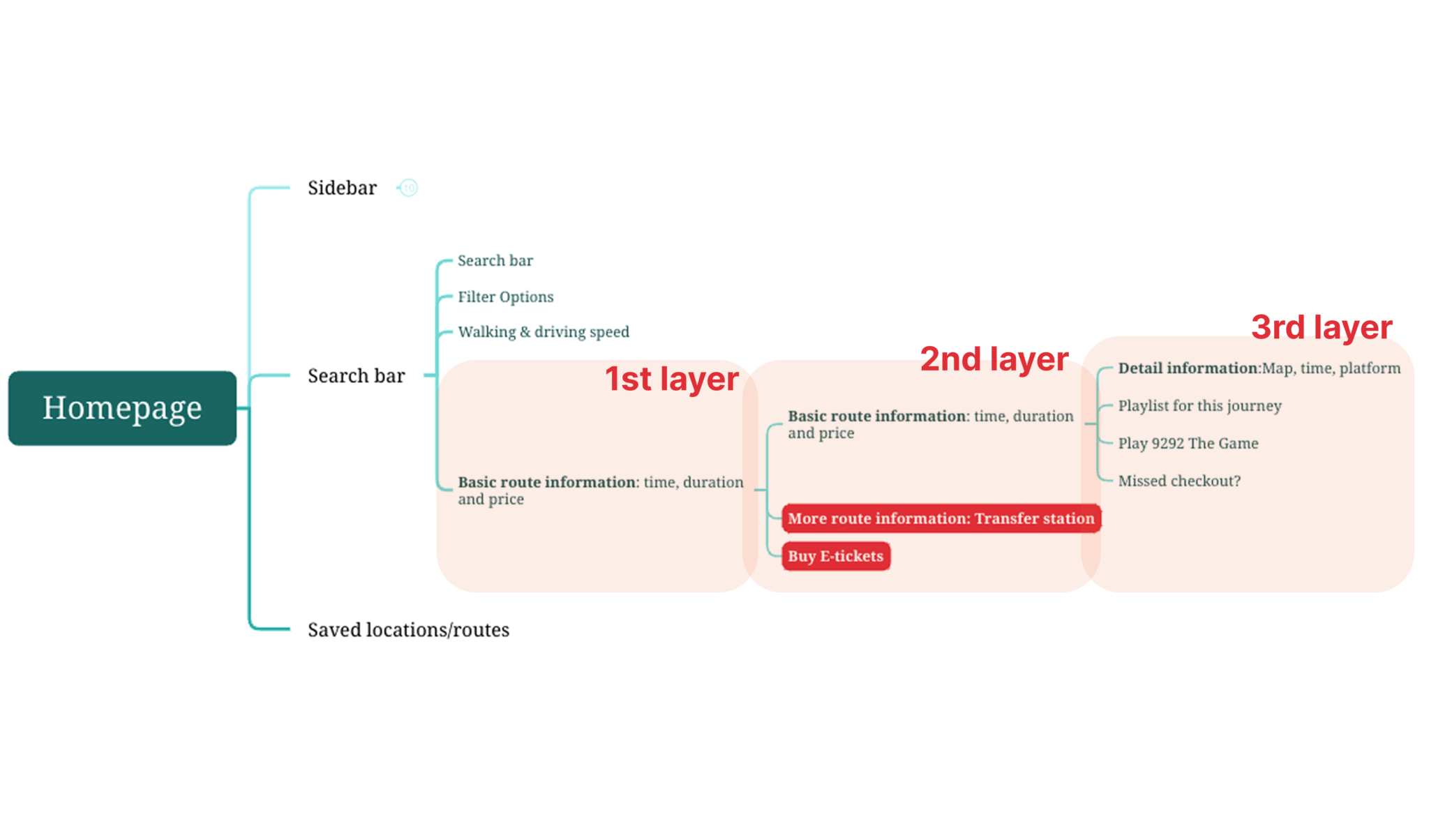
Structure route information into 3 layers:
- Brief Glance – Focuses on time for quick checks and transit updates, with the “Buy Tickets” feature included.
- Social Butterflied – Shows transfer stations and walking time for users who need quick route comparison
- Organized Planners – Provides full journey information for those less familiar with the route
To achieve "Considerate"
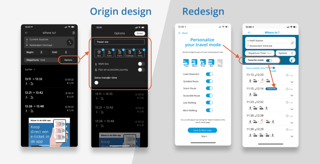
Redesign the filter options display and effect dispaly
Research Insights
- Toggling filter options do not result in noticeable changes to the route advice
- Many users tried to use ‘Extra Transfer Time’ and have high expectations for this feature
Redesign
- Highlight the filtered results
- Separate the ‘Extra Transfer Time’ feature from the filter menu
- Set a general “Favorite mode” during onboarding settings
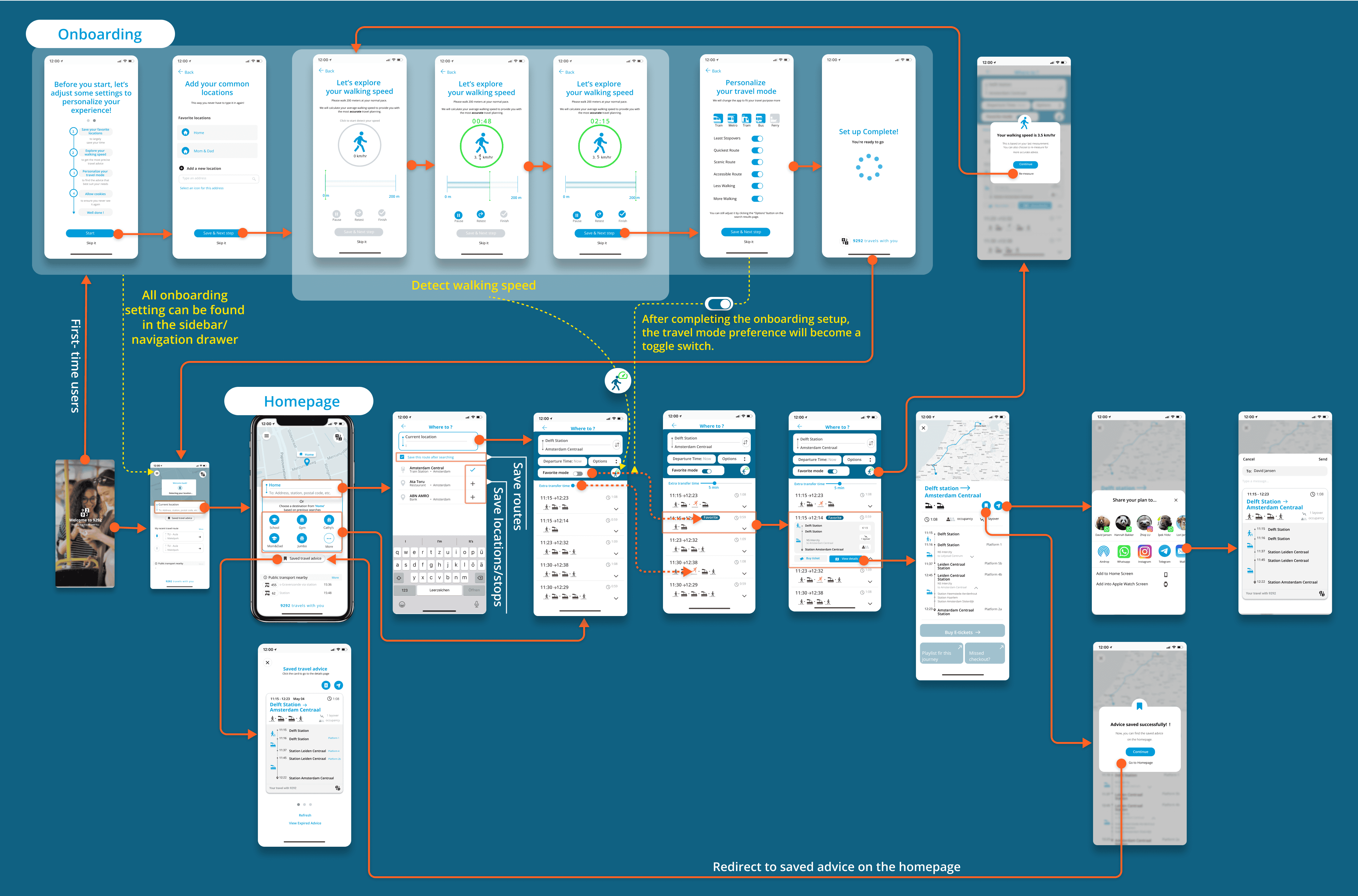
Refined Screen Flow
More Design Details
If you are interested,
find more explanations and design demonstrations here!
Deliver & Validation
Positive experience and improved usability performance
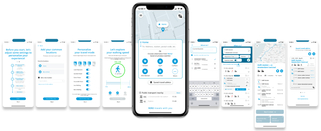
In our research, we set several goals, including improving the searching process, enhancing information presentation for more efficient comparison, and refining the saving and sharing features. After the redesign, we conducted a second user test with seven participants, involving usability testing, interviews, and a desirability test to explore users’ experience with redesign and improvements of existed usability issues.
There is already so much distractions when you’re traveling...It’s very nice that this APP kind of is a calm space
Together all these things make a really nice app and these things together would make me think its a trustworthy app
Quotes from participants
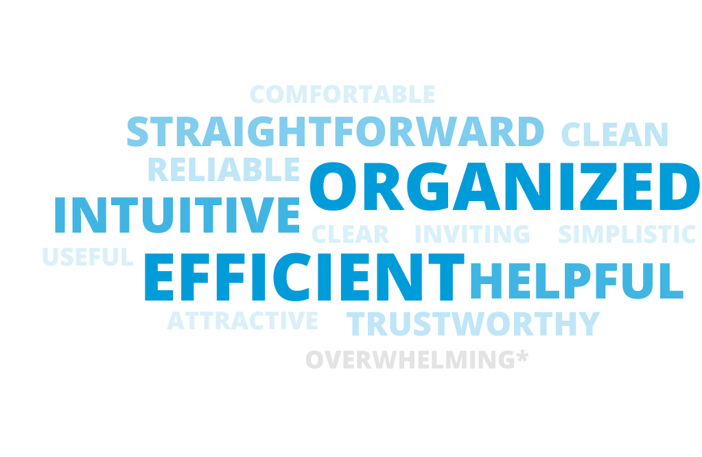
1. Positive experience with redesign
Three participants noted that the app’s straightforward design and access to abundant information and shortcuts made it highly efficient for them.
The redesign was described as intuitive, with two participants attributing this to their familiarity with similar travel apps and the app’s overall flow. Clear clickable areas and buttons contributed to a seamless, intuitive navigation experience.
Additionally, the redesign effectively presented essential information in a clean, uncluttered layout. Two participants highlighted the absence of distractions and the clarity of the design as particularly helpful.
2. Significant improvement in usability performance
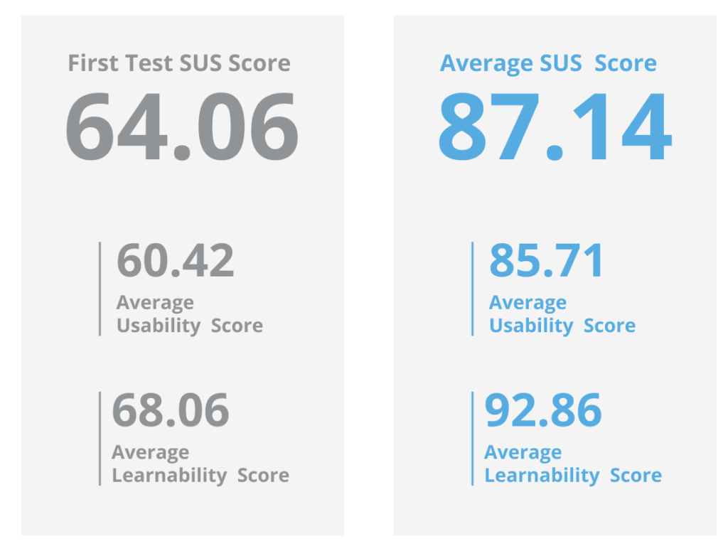
Compared to the previous average SUS score of 64.06, with learnability and usability scores of 68.06 and 60.42 respectively, the new SUS score of 87.14 represents a significant improvement.
3. Detail improvements for different features
Onboarding
"Onboarding is a welcome experience but could be too much"
Personalized
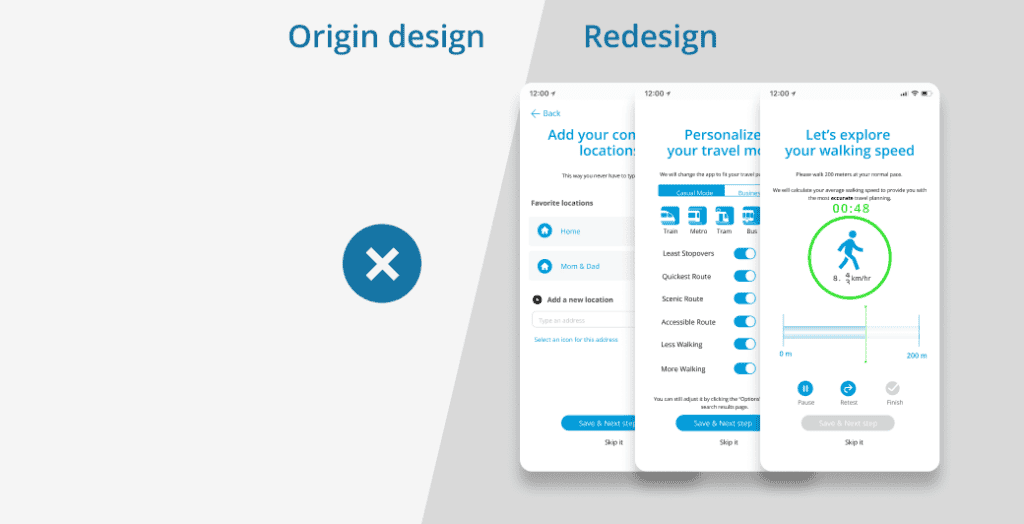
Most participants found the onboarding process clear and easy, appreciating its personalized approach compared to the current 9292 version.
Overwhlemed
However, 3/7 felt overwhelmed by the number of decisions required despite the tasks being straightforward.
Walking speed
"Calculate my walking speed makes it be a lot more personal, which I think is nice, because now the 9292 app feels very distant to me"
3/7 mentioned they liked the walking speed set up and most of our participants allowed the app to calculate all the options. While facing this feature, participants mentioned how they appreciate the feature and how it would be nice if the app calculated things for them.

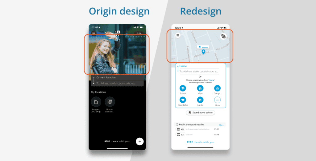
Map for orientation
"It’s easy that you were kind of guided into the screens like one to the next. And there was clear description above"
Although the map feature is currently designed to align with 9292’s focus on providing information rather than developing a full-fledged navigation tool like Google Maps, 3/7 appreciated the sense of orientation and trust it provided.
Searching & Adding favorites
It is for sure that searching first and then saving locations is a more intuitive process
During the test, 3 participants instinctively clicked on the search bar first, as they wanted to search for the location before saving route. We believe this change will significantly improve the likelihood of saving favorite locations, stops and routes.

Drop down menu
Users like the information design in the dropdown menu
Three out of seven participants used the dropdown menu during the test to compare different travel advice. It’s noteworthy that not all participants noticed this new feature, and once they tried it, they found it easy to learn.
Besides, 4/7 specifically appreciated the icons with small numbers at the bottom-right corner showing walking times, as they made comparisons quicker and clearer without needing to go to the next page.
Favortie mode
"I first had to digest that what does that colored block mean, but now that is nice and easy"
All participants appreciated the smart filter settings during onboarding. While 3 participants initially overlooked on the search result page or didn’t fully understand the feature, they quickly grasped its purpose and how to adjust it within 5 to 15 seconds. This interaction made the searching feel efficient and more intuitive for users.
Saved & Shared features
"I first had to digest that what does that colored block mean, but now that is nice and easy"
Six out of seven participants mentioned that the save and share features are now easy to find. They also found the icons clear and understandable.

Shared advice
"I think I would prefer this way of sharing because then i don’t have to have all these screenshots of the app in my camera roll."
The new version received mostly positive feedback during our user test. Six participants praised the layout and information, describing it as nice, clear, and interesting. Additionally, participants found the sharing process much more intuitive, as they could complete the “share” action quickly.
