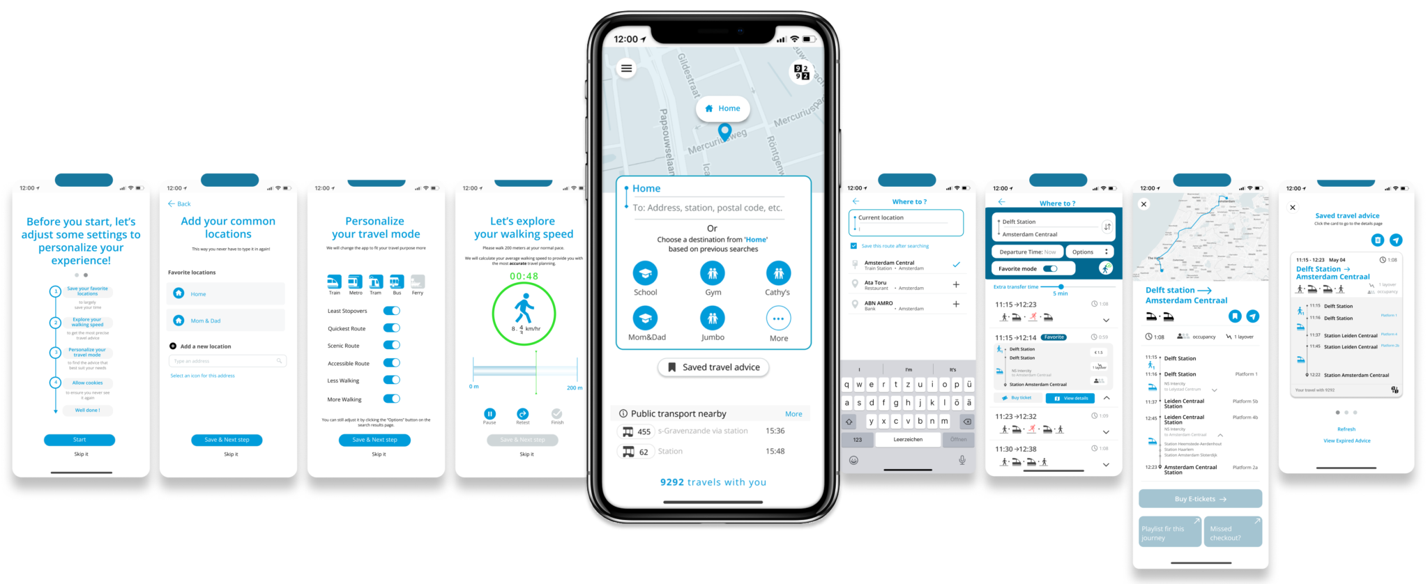
Improve the Efficiency and Accuracy of Searching
According to user research findings, the searching phase is the most crucial step for all users. During this phase, efficiency and accuracy are the primary requirements.
To reach the goal, we observed that a well-designed approach to adding locations and stations can improve the overall efficiency and accuracy of address searches while also helping the app better understand users’ travel habits. Beyond address search accuracy, 9292 also seeks to provide more precise travel advice by understanding users’ walking speed. Therefore, we focused on ‘adding favorites’ and ‘measuring walking speed’ to enhance the search functionality.
Change 1: Redesign the Process of Adding Favorites to ensure it seamlessly integrates into the user flow
Our user research found that users often don’t actively add favorites or even realize such a feature exists. Therefore, in the new design, we aim to integrate the process of adding favorites into the address-searching process.
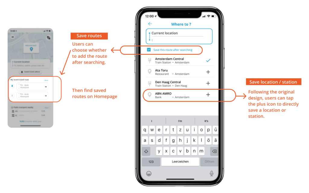
#Adding Routes and More Locations and Stations While Searching address
According to research findings, adding routes is not essential for most users, though some may still find it useful. As a result, we kept the feature but reduced the effort required to add routes.
Beyond the initial setup, users can intuitively add addresses, stations, or routes to their favorites directly during the address-searching process.
#Adding Common Locations during onboarding
Based on research findings, adding locations is a crucial feature for users. We recommend enabling users to complete adding common locations during the onboarding phase.
When users first launch the app, we encourage them to complete the setup process to provide the app with a basic understanding of their preferences, such as frequently used addresses or bus/train stations.
#Highlighting the Benefits of Adding Favorite Locations by Automatically Detecting Saved Locations
The app will automatically detect the starting point. If the detected location matches a saved location, it can prompt the user to apply it directly.
This design not only saves users time but also highlights the benefits of adding favorite locations while building trust in the app’s location accuracy.
#The More Frequently the App is Used, the Smoother the Search
As users interact with the app more frequently, it learns their travel patterns. Based on the user’s common routes, the app will display favorite locations in the search bar for quick selection.
For example, if a user frequently travels from “home” to “uni” or “supermarket,” once the starting point is set to “home,” the app will automatically suggest destinations like “uni and “supermarket.”
Change 2: Provide Accurate Estimated Walking Time by Incorporating Walking Speed
Originally, 9292 developed a walking speed measurement feature, but it was too hidden and not very intuitive for users. However, the intent behind this feature was good, aiming to provide more accurate walking time, we managed to keep this feature but optimize it. In the redesigned version, the app will learn the user’s walking speed over time and offer estimated walking times based on their pace, making the feature more intuitive and useful.
#Engaging Walking Speed Measure
During the onboarding, we’ve included a step to measure the user’s walking speed. The user just needs to walk naturally for about 200 meters while holding their phone, and the app will calculate an approximate walking speed based on the time taken.
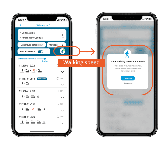
#Allowing users to adjust their walking speed at any time
On the search results page, users can click the walking speed button to adjust their walking speed at any time.
Make the Advice Comparison Process more Efficient
Many users reach the comparison stage, where their main focus shifts from just time to more detailed information, such as transfer stations, transfer times, and walking distances. However, the original design required users to constantly switch between search result pages and detailed pages while comparing different advice. To address this, we’ve refined the design to make the comparison process more efficient. We also extended 9292’s original design with filter options to help users narrow down advice that best suits their needs.
Change 1: Allowing Quick Comparisons
User research shows that users often switch between the search result page and the route detail page to compare different transfer options. Research also showed that not all users need to see the map during the comparison phase. Therefore, in the redesign, we moved important text information to earlier steps using a dropdown, allowing users to quickly compare different options on a single interface.
#Adding Drop-Down Feature
We introduced a drop-down feature to display essential text information, such as station name, occupancy expectation and walking time. Users can quickly compare multiple travel advice by dropping down different options simultaneously.
Change 2: Making Filtered Results more Distinct
In the original design, several filter options were available, such as ‘specify transport mode’ and ‘adjuextra transfer time.’ However, toggling these options did not result in noticeable changes to the route advice, leaving users unsure of what to focus on. In our redesign, we focus on developing filter options and highlighting the changes after activating the filter options.
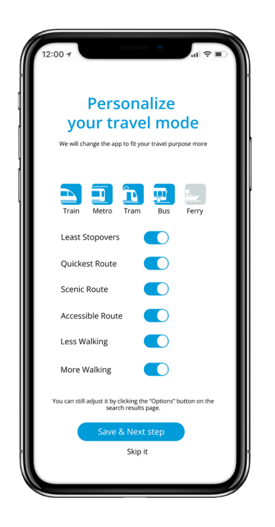
#Highlighting recommended advice
Our design recommendation is to incorporate these filter options during the initial setup. These preferences would then be integrated into a ‘favorite mode,’ which, when activated, provides travel advice tailored to the user, marked as ‘recommended.’
#Separating the ‘Extra Transfer Time’ Adjustment
Based on previous research, the ‘Extra transfer time’ feature is highly appealing to users. Therefore, we suggest moving this feature out of the Options menu to a more prominent position. Additionally, we aim to highlight travel advice that may pose a risk of missing transfers, helping users make more informed decisions.
Improve Accessibility to Important Features
In the research phase, we identified basic usability issues where features like saving and sharing advice were not easily recognized, and users were unsure where to find saved advice. To address these, we focused on improving the icon and layout design.
Change 1: Highlight the Save and Share Icons
In user research, we found that using the “+” symbol to represent saving was not intuitive for users. Additionally, the share function was hidden inside the “…” menu, making it difficult for users to find. To address this, we redesigned both icons and placed them prominently at the outer layer for easier access.
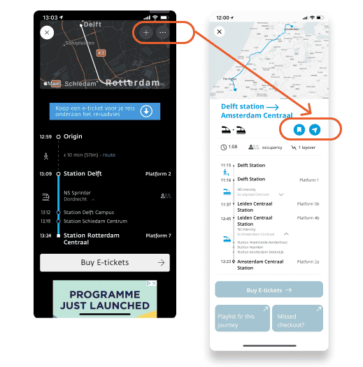
#Changes in Icon Design and Placement
In addition to redesigning saving and sharing icons, we also change their placement. Previously located in the top-right corner, the icons often blended in with the map, making them less noticeable. The new design moves the icons to the center beside the detailed information, improving both visibility and accessibility.
Change 2: Placing Saved Travel Advice on the Homepage
In the original design, saved advice was placed in the sidebar/ navigation drawer, making it difficult to find. To improve accessibility, we’ve redesigned saved travel advice as tickets and positioned them on the homepage, allowing users to more intuitively view, save, and share their travel advice.
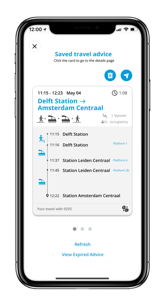
#Redesigning Saved Travel Advice as Tickets
In the research phase, some users questioned the difference between saved advice and saved routes. In the new design, we aim to visually distinguish them by emphasizing that saved advice represents a specific travel plan at a certain point in time. To achieve this, we took inspiration from the ticket design in Apple Wallet and transformed saved advice into a ticket-like format.
#Confirmation Feedback and Navigation of Saved Advice
After users press the save advice button, the new design provides confirmation feedback. If users have trouble finding their saved advice, a button is provided to directly navigate them to the homepage to view it.
#Applying Ticket Design to the Sharing Feature
In the original design, shared advice was presented as text with low readability. Therefore, we integrated the ticket design on saved advice with the sharing feature, making the shared information reads more user-friendly and visually appealing.