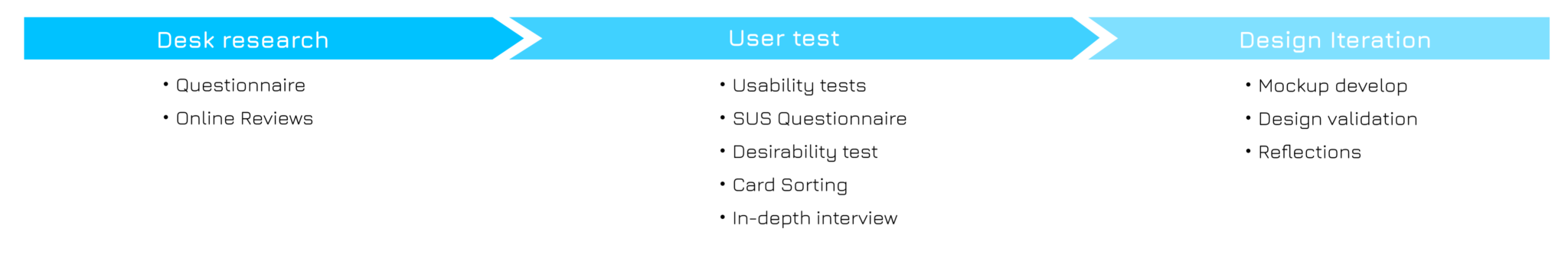
9292 users are information seekers, not explorers. They prioritize accurate route planning and presentation over additional services.
9292 users primarily plan familiar and repetitive routes
9292 users can be divided into brief glancers, social butterflies, and organized planners. Different user groups have varying needs in terms of functionality.
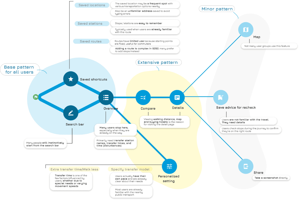
Saved favorites differ across user groups. While preferences vary, most users start by searching routes through the search bar.
9292 users value the presentation of search results: The way travel advice is presented impacts their ability to make comparisons.
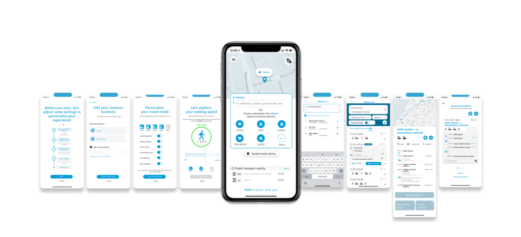
9292 has many filter options, but lacks differentiation in information presentation. Features like walking speed settings are hidden and not intuitive.
Some features, like saving advice and sharing, are important but not easily accessible or intuitive. These features are hidden, and saved advice is not readable.
1. Questionnaire
We reviewed the 2022 questionnaire by the 9292 team, which gathered 514 responses. It focused on public transport usage, reasons for using route planning apps, and preferences for personalized settings. We analyzed it and generated our own insights to shape the first user profiles.
2. Online reviews

We collected 112 online reviews from the Google Play and Apple App Stores, split between 54 Dutch and 58 English speakers. By clustering feedback, we identified common user issues and areas for potential improvement.
1. Random Field Interviews
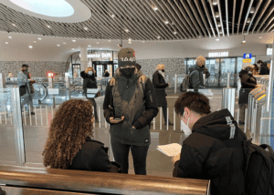
We conducted random interviews with 11 people at Delft Station and bus stops near TU Delft to understand their 9292 usage habits, including their opinions on customized settings.
Main questions include:
- Have you used 9292 app before? if not, why? Do you use an alternative instead?
- When do you usually use the app?
- Can you tell us a recent instance you used the app?
- for what purpose? where?
- How do you feel about customizing your app tIo your preferences?
- What is your reasoning behind choosing which locations to save?
2. In-depth interview
The interview was performed after the usability test. We composed questions that dig into users’ travel habits in order to make connections between the users’ perceived problems and their personal use patterns.
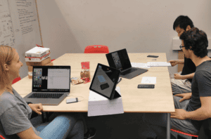
1. Usability test
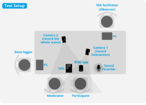
We recruited 8 participants aged 20-30, all with route planning experience. During the test, we designed three open-ended scenarios to encourage users to plan routes and explore personalized settings and filters.
2. SUS Scales (for Validation)
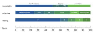
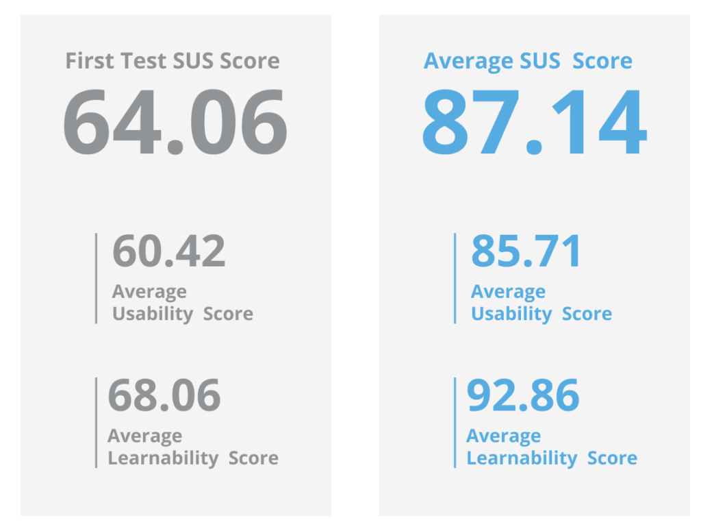
We used the SUS (System Usability Scale), a ten-item questionnaire, to assess the usability of 9292 app. A SUS score above 68 would be considered above average. We used SUS results to compare the usability differences between the original design and the redesign.
1. Desirability test
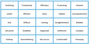
To measure intangible emotional responses from participants, we selected 25 vocabularies from the Microsoft Desirability Toolkit and required participants to select five words that best described the products. It helped participants to describe their current and expected using experience.
2. Card sorting
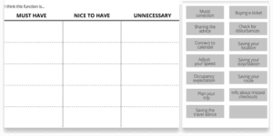
In order to understand users’ priority of requirements for each function, we conducted card sorting. Participants were given a predetermined set of categories: must-have, nice-to-have, and unnecessary. They were asked to organize different features into these categories based on their personal experience.